Thursday, 10 December 2009

How did you use media technologies in the construction and research, planning and evaluation stages?

During the process of our coursework we used a wide variety of new media technologies. The internet was the most useful in terms of research, planning and evaluation my coursework. I began with useful search engines such as Google and Bing to find out about the artist, the genre and similar artists. Wikipedia was also an important website we used to find out about Kate miller Heidke, the awards shes won and her previous musical history.


A picture of us during the research stage

After this process of biography research, we wanted to find music videos of Kate Miller Heidke and the other artists we researched. The obvious choice was Youtube where there are over 67.5 million users in the U.S.A alone. I also wanted to listen to these artists reuglarly and listen to their albums, so i downloaded Spotify and became a member of Last FM - where i could listen to more unique individual artists.


The first part of planning my music video meant that i had to take pictures of where i was filming and the actors i would choose to play my part. I took these pictures using a compact digital camera and then uploaded them onto the blog. We then wrote out our initial ideas on photoshop to make it easier to upload on the blog. After this we decided to make story boards to further plan out our initial ideas and to make sure i could display them on the blog i used a scanner.

When the contruction stage took place we used an Sony HD camera, a tripod and a dolly. This meant we could get the best shots possibe without any shakes, as well as stready pans, zooms and tilts. Once we had all the footage we needed it was time for the editing stage, where we used two different programmes - imovie and final cut pro. They were easy to get used to, but because of the vast amount of footage we had, the editing seemed daunting. We started the video with quick jump cutting of Abi moving around the bench, making sure that each cut was on the beat of the song. This is an important convention of any music video that we feel we followed. Furthermore we faced problems during the editing process because our footage was not good enough to fill the narrative part of the film. However this was then combatted when we filmed again getting the footage we needed.

After most of the film was done, we concentrated on the construction of the CD cover and advertisement. For this we used Adobe Photoshop and Adobe Illustrator, both programmes we had never used before and therefore was new to the whole process. The first part was taking the pictures that we wanted, we used the Sony HD camera to take the pictures so that it was easy to upload. We took pictures of a close up of Abi's face, a picture of the three girls together and then many pictures of Abi around the pitch for the inside cover. After this we uploaded them onto the brand new macs that have been very useful during the whole coursework process. We got used to the two programmes and started the front cover of the digipack - adding the close up of Abi's face and the three girls together in the background. After we complelted our first drafe we felt it needed change and so changed the font and made the overall cover lighter. The inside cover was the next target adding all the photos of Abi around the pitch - resulting in lots of layers,because of the number pictures we added. After this was done we had to stretch the photo to fit the double page of the digipack. The new technologies we used for creating the digipack and advertisement certainly helped us to creat two proffesional products.

Monday, 7 December 2009

In what ways does your media product use, develop or challenge forms and conventions of real media products?

When contemplating initial ideas for our music video it was very important that we focused on the main theme of the song and the style of the characters and mis-en-scene. This style certainly develops many forms and conventions of other music videos that are of a similar style. The mis-en-scene is obviously a huge part of any music video and with this done poorly a music video can look unprofessional and will not fit the style of the song. We feel that we concentrated a lot on the mis-en-scene, however there were some parts that we did not pay enough attention to.


Conventions of a CD cover of a similar genre ¬
Previously in the blog I have looked at CD covers such as Lady GaGa and La Roux that I feel that I have used, developed and challenged. Here are further examples of similar CD covers that show the conventions of the pop genre.


Conventions we used for the CD cover


• As you can see we have used many conventions from both the La roux album and lady GaGa. In all four-album covers there head takes up most of the cover. We used this convention too some respect by having a close up of Abi on the left side of the album cover. Making them the main part of the cover therefore makes the artists very noticeable.
• Another convention we used was the choice of font and how we purposely selected it to suit the rest of the album. The font of Lady Gaga’s album certainly suits it’s celebrity style and so we choose a quirky font to match the quirky style of the song and music video.
• Another convention of an album cover we used was the position of the singer. When looking at other artists it was more often than not centred either at the top or bottom of the cover. Although this may seem obvious many artists choose to position the title in a different place due to the picture or even not have their name on the front cover at all.
• The back cover was also pretty conventional with the song list taking up most of the space on the front cover and the picture not really being very important. The song list is obviously the most important part of the back cover and therefore the font choice and colour is again very important – it needs to be readable but also stand out. We feel that our back cover does this. We made sure that the writing was readable by making it a standard white and making sure none of the background distorted the writing.
• The barcode and extra information is also an important feature of any back cover and is therefore why we added that. We made sure there was enough room for these features by altering the song list.


Conventions we developed & challenged for the CD cover


• The background of our album cover has challenged many other artists in the same genre who have simply just used a plain colour with some lighting, it is not very noticeable and instead the artist is made the centre of attention. However on the other album covers the background is certainly not very noticeable. Therefore we challenged the convention of the background by making it an important scenic shot. This is very different to the other albums – La Roux’s is a simple red background. Compared to ours where we used a sketchy effect from photoshop on a scenic background of tress and part of the hockey pitch. Obviously the lighting of our cover is used in photoshop and we feel it looks very effective. The gradient tool was used regularly to add lighting from different angles – adding a natural sunlight to the front cover.
• We also developed other album covers of the same genre by adding three secondary characters that were used in the music video to display Abi as unpopular & clumsy. However this personality is not really seen in our album cover because it was only the theme in one song and not a recurring theme. The same can be said in Kate Miller Heidke video of The Last Day on the Earth in which the video follows a lonely theme which is not seen on the album cover (Little Eve) – which is colourful.
• We also developed the convention of the back cover by adding Kate Miller Heidke’s name in same colour and font as on the front cover. We did not find many artists had done this and thought that it added more to the back cover.


Conventions of a Advertisement of a similar genre


As you can see our advert shows some similarities to that of Lady Gaga and other pop artists.


Conventions of a Pop Music Video


We challenged the conventions of a music video by having a unique idea which we have related to the text. To challenge the conventions of the kind of character you would have in a music video we chose to have our main character as a clumsy outsider who can’t play hockey. This contrasts to the usual hit music videos that have attractive young woman as the main focus of the video. Such as, Brtiney Spears;


Mis-en-scene –We used costumes to symbolise how Abi was left out of the group of girls who wear all wearing the same outfit. Abi is left in the changing room deciding what to wear as she wasn’t good enough to wear the same kit as the other three girls. This was subverting the typical genre of pretty girls always fitting in and being popular because Abi the main actress is attractive yet still disclosed from the group. We also used different colour hair bands as the tempo of the music and the different colours of Abi’s tops added colour to the costumes. We used natural lighting outside and when we filmed in the changing room it was slightly dimmer to contrast with the natural outside lighting. We used the conventions of a typical actress from music videos to create the look of the girls playing hockey. With lots of make up and the main girl having eye shadow and rave paint on her face. We did this to show the video was to do with fitting in and how the main girl tried to copy the others so they would accept her.  
Setting – As our video was based around hockey we filmed outside on the hockey pitch and in the changing room.

Editing – As the music was fast paced and it had a strong beat throughout the song we had to speed up some of clips to go with the beat. Such as when Abi was hitting the ball and when she was walking down to the pitch. This is an alternative we used instead of cutting out irrelevant information we sped it up to make it go with the music and the temp of the song. We also edited certain scenes so Abi moved position on every beat to add variety to the shots. As it is very conventional for music videos to jump cut to the beat of the song we did this in our video. We also sped some images up and put them in a different order to create variety and avoid repetitive shots.

Camerawork – We used a variety of shots in our music video such as ariel shots to look down on Abi as she was singing the lyrics, cutting to close ups and shots from the side of her. We varied our shots outside with full shots of the pathway to close ups of the stick. These are typical conventions from pop music videos which are used to create a fast paced, fun and easy to watch video. Another typical convention of a music video is the cut from a long shot of the character to a close up of the singing. We used this convention while Abi was in the changing room. 

Comparison with other Music videos
Girls Can't Catch - Keep Your Head Up

Girls Can’t Catch | MySpace Music Videos
   

We feel that this music video by Girls Can't Catch is a good way to show how we have used and challenged conventions of a pop music video. Conventions that we used that are also clear in this video are the close up's of the main singer or singers to represent the main character(s). Furthermore the fast editing pace in both our music video and Girls Can't Catch shows the theme of competing in both music video's. Another convention that is clear we used is the setting - which was obviously very important to set the scene and the plot of the music video. Costumes in both our video and Girls Can't Catch is a further necessity and convention we used.

However there are also conventions we challenged in our music video - most obviously (as previously mentioned) the blonde, good looking girl being unpopular and clumsy throughout the music video. This is obviously challenging other famous pop videos where the Main singer is the most popular girl showing attitude and dancing etc. This is certainly shown in many of Brittany Spears music videos where she shows star image and voyeurism. Furthermore we again challenged a convention seen in many pop videos by having no boys with the girls and instead only including girls. This convention can be very important in pop videos to further show the main characters popularity. Both these conventions we challenged are certainly shown in Brittany Spear's most famous pop video "Hit me Baby One More Time"


Advertisement and CD cover conclusion – The most important aspect of the advertisement and CD cover is that it’s the first thing peoples eye are drawn to. Using bright colours and an attractive girl on the front ensures that the socio demographic group we were aiming the CD at are attracted to it. We used bold writing and an interesting font so you could see the artist clearly. We also put the singer on the front cover so people would recognise the singer, this is done with millions of CD covers. For example;  


We also used the background of the girls in the background to show some background to the songs and the music video. We used synergy by having the advertisement the same background and lots of images of the main singer. We also used the same font to advertise it so people would be able to see it in the shops and see the similarities.

What have you learnt from your audience feedback?

What have you learnt from your audience feedback?


With 100% of people saying that they enjoyed the music video and 16 out of 18 people giving it a 7 or 8 out of 10 the analysis of our feedback started off well. However, 70 % of people who watched our film were between 15 and 24 which meant that we wouldn’t get a broad amount of feedback from different ages. However, this doesn’t affect our audience feedback as our main target audience is 15 – 24 years of age.


As there is a higher percentage of men who watched our video this might mean that the feedback would be different if there was an even amount of male and female, however, this didn’t effect our results too much as many of the males agreed on aspects of our music video for example, that the theme match the song pace and style.


Due to the music video only getting 90% yes’ for the song matching our theme we relooked at our music video and changed some clips so that the clips changed on the beat so the music flowed more with the video. We then filmed more shots of the main actress Abi, giving it a more defined storyline so the theme would come together more.


As our music video is very fast paced with very quick editing it was hard to keep the music in sync with the singing. This is our biggest down fall in our video with only roughly 12% of the audience saying it was in sync and roughly 80% of people saying that it was mostly in sync with the music. This feedback was useful as we then went back to redo some of the music video which may have been slightly out of time to make the music video look more professional.


This pie chart shows that nearly half of our audience thinks that the main actors are the most important aspect of a music video and then the editing and then the setting. It was interesting to see that no one thought that the costume was an important aspect of a music video. I thought it was essential to have all the girls in the exact same outfits to make the video look more realistic but seeing the results I now realise that I should have concentrated more on the main actor and the setting than the costumes.


When asked what the most important aspects of a music video the audience thought that editing was the by far the most important. The results of the “two aspects which could be improved on” are reflected positively on this front because only 2 votes went towards editing. This shows that the editing of the video was successful and did not need to be improved on. The audience voted that costumes were the least essential aspect in a music video however, they this was the 3rd aspect that they thought should be improved in our video. This could show that on whole our music video was at a good standard and they therefore targeted the smaller aspects of the video i.e. the costumes. Even though 90% of the audience said earlier on in the questionnaire that the song went with the theme of the music video, the storyline came top on aspects to improve. This feedback shows that the feedback was inconsistent, however, when looking at our music video we decided to agree with the audience’s feedback. To make the music video have more of a story we changed a few scenes around and filmed the main character (Abi,) looking at the clock and then running down to the pitch to meet the girls. We also moved forward the scene where she couldn’t decide on what to wear to emphasise Abi struggling to fit in with the girls.


Due to the statistics earlier on in the questionnaire I was suspecting lip syncing to be the aspect the audience thought we most needed to work on, however, it was the 4th out of 7 aspects to be improved on. Camerawork was voted in just behind this. I thought this was accurate as we had a lot of variety in shots with close ups and different angles for this not to be one of the most important aspects for us to improve on.


Sunday, 6 December 2009

How effective is the combination of your main product and ancillary texts?


The three products work very well together due to the fact that they compliment the main theme seen in the video and meet many of the conventions of the genre. We decided to carry on the theme of hockey within the album and advertisement to make the ancillary texts even more recognisable with the same costumes, characters and setting used in all three. Although all three products follow the same style, we feel that they will still be very interesting and relevant to our audience.

This is first of all obvious with the clear link between the video and the front cover of the album. Where we used a close up picture of Abi with the pink top and blue headband (also used in our music video) and a long shot of the girls who also featured a lot in the video. This direct link shows the audience that they can immediately recognise and link with the group of people in the video or album cover. Keeping the costumes the same was also a key part of the project and further shows that our three texts are very effective with the use of synergy. However problems were faced during filming – we lost the blue headband. Although it was not a vital part of the video it meant we could not use a different headband unless we changed the whole costume, so we did. To combat this problem and still make sure there was not problems with continuity we made it seem like our actress had just changed instead. This effect actually worked very well and adds a nice effect to the video. 

Moreover the inside cover, advertisement and one scene in the video all follow the same effect to further show that our combination of products is effective. The effect is many different pictures of our actress in different poses on the hockey pitch in her recognisable yellow and purple hockey kit. By using adobe photoshop it meant that we could cut out each individual picture of Abi and put them all in the same background, creating the effect that they were all on different parts of pitch in different poses. As you can see the inside cover and advertisement are very similar to again make our artist recognisable. 


When comparing how other well known artists of the same genre use synergy on their products we found out that they took the same approach as us. We rarely found any that used a different theme or style/font when comparing album covers with posters.
This is so that their target audience can recognise the link between the advertisement and album cover to make sure they will buy it. Here are some well known artists who use synergy with their products. 


As you can see the comparison between the Black Eyed Peas album – The END is almost identical. The exact same image and font our used and the only real difference is the size of the writing. This just shows that number 1 hit groups such as The Black Eyed Peas use synergy to advertise their products.


However when comparing artist’s music videos to the album cover or font they could be very different. Nevertheless there is good reason for this, it is because the music videos we watched were just one song of the album and therefore it would be unlikely to base a whole album on just one song. However some artists do follow this approach and it can create a very effective front cover. For example Beyonce’s hit single Single Ladies follows a very similar black and white style to her album cover for I Am.


We feel that the combination of our products is very effective because of the clear link between each product and the continuation of style seen in all three products. This has been done to have a direct effect on our audience and to make sure our artist is recognisible in all texts – this has certainly been done and hopefully done well with many conventions developed and challenged from the wide range of artists we have looked at.

Monday, 30 November 2009

Editing

Final Cut Pro

We used Final cut Pro to edit our video on the apple mac computers provided by the media department. Using Final cut Pro was a lot more efficient when loading the video clips onto the programme than Adobe Preiemere Pro as you could load them directly to imovie and then to the editing programme instead of having to rename all of the files.

When all the files were imported and we started to edit the clips we realised that we had more filming to do, due to shots not being centred and some being shaky. When we had all the shots it was easier to see what went where, as we went along we found it easier and quicker to use short keys, for example 'z' to zoom in and 'b' to cut the clips.

The names of the clips were on the left hand side and you could double click them to make them appear on the screen or drag them onto the editing panel. You also have a second window which you can watch the edited clips on. There is an option to use transitions but due to the fast pace of the music we did not feel it was necessary to use fade in/outs and dissolves.

It was hard to get the actors to sink with the music, taking a lot of time, patience and effort. It also took along time to get the clips in time with the music to make the video come together as an upbeat, fun music video.

This is an example of final cut pro and the layout. You can see where you can drag the clips from the left hand side onto the main panel, using the curser to place the images accuratly.

Wednesday, 25 November 2009

CD covers - draft and finshed versions.

The Front Cover

Here is our first draft of the front cover of the CD. As you can see we have added the background - a photo taken from the hockey pitch of the goal and trees and field in the distance, the main photo of Abi in her first costume - pink top and blue headband. With 3 of the girls in the background with different coloured headbands. We obviously wanted Abi (acting as Kate Miller Heidke) to be the biggest part of the CD and because many of the cd's we looked at had only the artists face on the front cover (Lady Gaga, La Roux) , we decided to use the same idea and aspect. As we were new to the programmes we used, Adobe photoshop and Illustrator we did not know the wide variety of filters we could use on the pictures. Therefore we did not know how to get the effect that we wanted - bright and quirky to match the mood of the song and the artist. So instead we just faded the background and blurred the 3 girls to add the effect that there were on the pitch.
We choose the font as shown earlier in the blog out of a number of choices and decided that it would work best - furthermore we decided the blue for the time being matched the CD cover because it was the same as her head band and stripes.
However once we learnt how to photoshop and learnt all the different tools that could be used - we made BIG changes to the front cover.
Here is our Final Version.


 We began by deciding that the background was not working, and was too dull and did'nt show any real colour. On Adobe Photoshop we filtered the background to get the cartoon effect you can see, we then increased the brightness to it to make sure the colours were much more vivid. Aswell as adding colour to the background we then felt that Abi herself was slightly dull, so we added a line of light from the top left corner diagonally to the bottom right hand corner, this made sure that her hair and face had much more colour to them. Furthermore we made sure that the 3 girls were not as obvious as in the draft and faded and blurred them more into the background. Finally we changed the font hugely adding a drop shadow and completley changing the colour. We felt that the blue was not working and added to the dullness seen in the first draft, therefore we choose a yellowy orange add to the bright effect and match the secondary outfit used by abi seen in the inside cover. We feel that the front cover works very well and creates the themes that we wanted, it is bright and has a sketched style background therefore shows the quirky side of Kate, but the photo of Abi shows the more serious side to other songs on the album.


The Back Cover

 The image you see below is not the very first draft but the second draft. The first draft had no effect on the background and looked much duller. Furthermore the font had no colour to it or shadow to it - looking very plain and normal (not the effect we wanted). Obviously the song list is a vital part of the back cover because it lets the buyer know what they are getting. Therefore the backcover has to look good and display the artists style.  We feel that we did not do this in this draft and so had to re-do it and make some changes - especially to the font. We also needed to add key information and a barcode on at the bottom of the cover,


As you can see the changes we made are not as obvious as the changes on the front cover. However we did make some very important changes that effect the back cover. For example the font has been tweeked - Different shades of oranges are ised and the drop shadpw has been added. We also made the sketchy effect more obvious on the background and added a light from the top right corner - using soft light. We decided to make the back cover overall a bit darker than the front. Furthermore a barcode has been added and on the final version, information will be added about the record label, producers etc.
The Inside Cover


Here is the final version for the inside cover of our digi pack. While researching many digi packs from popular artists we discovered that it was very common and also popular to have the inside cover both panels. So we decided to follow this convention and display many images of Abi in different poses across the hockey pitch where we filmed a large part of our video. We feel that this effect works very well and each image displays the style of our video and also Kate Miller Heidke. To create this effect we used both Adobe Photoshop and Adobe Illustrator. We began the process by taking a picture of the background that we decided to use, the picture we took works very well because it covers a large amount of the hockey pitch, the goal and the autumn trees that is also seen on the front cover. We then kept the camera in the exact same position and took many pictures of Abi around the pitch in different poses, close up and far away from the camera. Once the pictures were taken we uploaded the background on to Photoshop and then cut out and cropped the pictures of Abi and imported them on to the background. Because we had never used photoshop before this took a while to get used to but once we worked out exactly what to do it became second nature, this process also showed us how important the layers were on photoshop. Once all the photo's were on the main background we made sure it actually looked like each figure was on the pitch by smoothing around the edges and adding shadows. Finally we added some lighting to the background and our final image was created.
As a final touch to the inside cover we followed the convention of many digipacks and added extra information about the singer, produces, artwork etc in the bottom right panel. We did contemplate whether to create a booklet but thought it was pointless because no other extra information needed to be added.


Digi pack completley finished - We were very pleased with the final version of the digi pack and feel that it looks like a real album. I believe that the inside cover works very well and the effectts that we found out while using photoshop also work very well on the front and back cover. The final version certainly displays the style we were after and displays the theme that is displayed in the music video and also Kate Miller Heidke's other videos.


Intial Ideas - Advertisement

  • We feel that the picture used on the inside of the CD cover - Abi in different poses around the hockey pitch - is very effective and works well. Therefore we will crop this and use it as the background for the advertisement.
  • We will change the colours of the background - adding more light to the sky, making a lighter blue and also adding a ray of yellow light to act as sunlight. We will also use less of the pictures because we do not want it to be too messy of overcrowded.
  • The font used will be the same as the CD cover for Kate Miller Heidke & Little Eve but will be different when writing other information such as what songs the album will include, when the album is out, the website etc.
  • Other Idea's - Will have a similar setup to the previous idea but a different background will be used - instead will have Abi leaning against the metal fence with the hockey pitch in the background. This image will work well becasue of the fence that will cover the whole poster.
  • The fonts will be the same as the previous idea but because there will be more space, more information will be displayed, e.g reviews and a picture of the CD front cover will be displayed on it.

Tuesday, 24 November 2009

Choices of Font Type

Choosing the right font is essential to our CD cover and how the final image is portrayed. We wanted to find a font which was fun and quirky like Kate's style of music, avoiding common fonts such as Times New Roman, Comic Sans and Arial which would mainly be used for magazine articles, newspapers, books and website pages.
A great site with a wide variety of fonts on is fontspace.com which gave a wide variety of hand written and fun fonts to choose from. A few examples of fonts that we looked at include;


As you can see we have looked at a wide range of fonts from both fontspace and 1001freefonts which give anyone the chance to download thousands of fonts. We decided to look at a variety of fonts from a more stylish but simple look seen in 1. and 3. to more exciting fonts such 4. and 5. which use a curly style and a brush style. However we decided that we wanted something more in the middle that was both stylish and quirky.


We chose 2 different fonts to match the mood of the song and Kate's overall theme. This first one we choose as seen bellow was because it wasn't too feminine and it was slightly different and quirky which is how Kate Miller Heidke sees herself. However this font will not be used on the CD cover and instead will be used to display key information on the advertisement - such as hits the album includes, website information and when it is out.


The second font we choose was from a different website - www.1001fonts.com. This one will be used for the CD cover and will be used for Kate's name and Little Eve (the album title). We will this one is more exciting and quirky that the first and will suit the front cover and background of the album.


Saturday, 14 November 2009

Magazine advertisments


As you can see from the 4 sample magazine advertisments from KERRANG! they all vary from no writing at al which would be more common from a well known artists, such as 'Them Crooked Vultures', to album adverts with lots of writing on them such as 'The Blackout' who have written about their new single, their tour and website page. You  can also see that their background is the same as their album cover with the same font and colour on the advert also. The advert for Flyleaf is inbetween with when it's out and where you can buy it from, showing a clear and simple advert.

Wednesday, 11 November 2009

Looking Back on the First Day of Filming


Camera Equipment – We have had no problems using the SD camera and were able to get some important shots still shots using the tripod. However we hope to use more moving shots with the tracking and dolly. Furthermore we had hoped to be able to use two camera’s at once but unfortunately the other camera’s were in use and therefore we could not do this. This would have been useful to make sure when it came to the editing process we would have a number of different angles and shots to choose from.


Our first day of filming on Sunday went well in terms of planning and practice. We found out exactly what we wanted to do and how we could improve previous shots filmed that day. However we did not get as much filmed as we had hoped to do and only filmed about 25 minutes of footage, this meant that when we came to the editing stage we would struggle to edit the whole video effectively.


We therefore realised that we needed to plan each individual shot before our next filming day to make sure that we were thoroughly organised and would not have to make the filming a time consuming task. Furthermore we need to plan with our actors the exact time and date of when our next film date is so we can make sure that they know when to turn up and what to wear. If we do this then the filming will get done a lot easier without any confusion of timing etc.


Obviously we used the same equipment as last year but we feel we have progressed in our ability to use the equipment since then. Although on our first day of filming we only used the tripod we will hope to use other equipment such as the dolly, tracking and the crane for some important high angles during the chorus.


Monday, 9 November 2009

Filming we want to include

Other key shots which we want to film:

Close up of Abi's face at a high angle whilst singing the first verse.

Close up of Abis foot and her head on her knee - singing into the camera

Close up of "brown eyes" - start with filming the face ad then zoom in on "big brown eyes"

"I've got a feeling that I look absurd" - reflm Abi doing it

Chorus - Have the 4 girls walking in a line in slow motion and film them individually - zooming in and then going back the the full shot.

Chorus 2 - Girls playing hockey and hitting the ball, each girl in the same position hitting the ball with close ups of their faces and the full shot as well.

Further Filming - Lyrics

When we go out dancing on a Friday night
I get this funny feeling something's not quite right
My sense of rhythm is incontrovertibly shite
I can't fake it


Whole verse –

1 Foot up on the bench and head looking into the camera

2 Abi on the floor

3 Putting on her make up

4 Singing into the camera and zoom in

I can see the pity in your big brown eyes
The perpetrator lies between my back and my thighs
It doesn't want to wiggle though I try try try
I can't make it

Whole verse –
1 Abi on the floor
Zoom in

I get the feeling that I look absurd
I get the feeling that I look absurd - and it hurts

Taking off cardigan
Drop hockey stick on the floor
Drop to knees


I just can't shake it
Abi trying to hit the ball but keeps missing, sings into the camera – moving towards it.
Girls are hitting the ball well, sticks go on the floor in sequence and then they swing the stick at same time

Couldn't walk the line inside the country scene
And disco was a flop I'm sure no dancing queen
Couldn't really qualify for breakdancing
I just break it


Close up of feet on bench walking
Fall off the bench – slow motion
Girls doing poses with stick and then Abi falls over/can’t do it

Tried moving my body to the latest hit
Someone called the nurse thought I was having a fit
I execute the moonwalk like I stepped in shit
I can't take it

Give the girls one line each and sing it as they’re moving towards the camera.

I get the feeling that I look absurd
I get the feeling that I look absurd - and it hurts


Sing these lyrics as well

I just can't shake it


Switches between shots of the girls walking with stick over shoulder and Abi missing the ball, and then all of the balls being hit at Abi.

OHH
Switching places on the bench - singing the lyrics


EXTRA
Basic passes with the ball
Dribbling towards the camera


Sunday, 8 November 2009

Magazine advertisment

Components that my advertisment must have our shown on this following example of BWO's advertisment in 'attitude'.


The main focus of the advertisment would be the picture on the front of the cd cover and the two new hit singles. Having the singles written on the advert would make the respective buyers want to get the album and see what new msic they've produced.

I would also include the three past alubms that Kate Miller Heidke has done, with a sticker on the front saying BRAND NEW as she isn't well known in the uk.

Thursday, 5 November 2009

Cd Packaging

How we are going to present our cd cover:

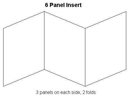
We have are deciding on whether to present our cd in a 6 Panel Insert with the cd in the middle and the two flaps on either side or a normal 4 Panel insert with a wallet on either side to hold the CD and maybe a small booklet of we have time. There are some examples of this below;


We have chosen to have the lyrics of our album on the right hand side of the cd or in a booklet and a picture of Kate Miller Heidke on the left hand side, with a picture on under the plastic case were the Cd goes.
Another idea for the inside of the CD is to have many different pictures of Abi in different poses around the hockey pitch, this will cover the double page of the 4 panel.

The songs in the alubm are as follows:

Partment

Australian Idol

Can't Shake It

Caught In The Crowd

Delay

Don't Let Go

Hello

I Got The Way

Little Adam

Make It Last

Mama

Monster

Out And In

Shoebox

Space They Cannot Touch

The Last Day On Earth

Words

With Can't shake it as the hit single - this will be advertised in the poster